Scary ways to use hierarchy of scale
Patreon and a new series of critique posts
Just a quick announcement before the meat of the essay. If you’re only here to learn cool things, feel free to skip it.
I’m finally back for more critique-writing! The number of individuals excited by this announcement might be small, but I’m one of them, which is all that counts, right?
Time has been short lately—apparently it’s been almost a year since my last post here. I made good use of that time, though, starting college, releasing a horror game on Steam, and volunteering as a gamedev tutor for refugee teens. I still feel like I could be doing more for the community, though, if I had a bit more resources to work with.
So I’ve started a Patreon campaign! If you’ve never used it, Patreon is a Kickstarter-like platform for supporting your favorite creators on a monthly or per-piece basis. So instead of Kickstarting this whole project, I’m asking for smaller monthly donations to help me cover web hosting and other expenses involved in writing/gamedev.
My first goal is to write these critique posts regularly again. To make this realistic, I’ll be writing just one long-form post per month (such as the previous critique posts I’ve made covering entire games in depth), along with three short-form micro-critiques made to point out little spots of great design within bigger works (kind of like this post).
So, if you like my writing or my games, please take a look at the Patreon page and consider giving whatever you can in the way of support.
Now for the first micro-critique!
Introductory vocab & Spoilers
Hierarchy of scale, or hierarchical proportion, is a term used in Art History to describe how the sizes of parts in a painting or sculpture inform the audience what’s important and what isn’t. You can find lots of ancient examples with a quick Google search, or on Wikipedia. The classic example is a king shown three times larger than his subjects, or a fertility statue’s unnaturally large breasts.
We’ll be looking at semi-spoilery examples from a game (Metroid Prime), a TV show (Steven Universe), and a comic book (Saga).
Big things are scary
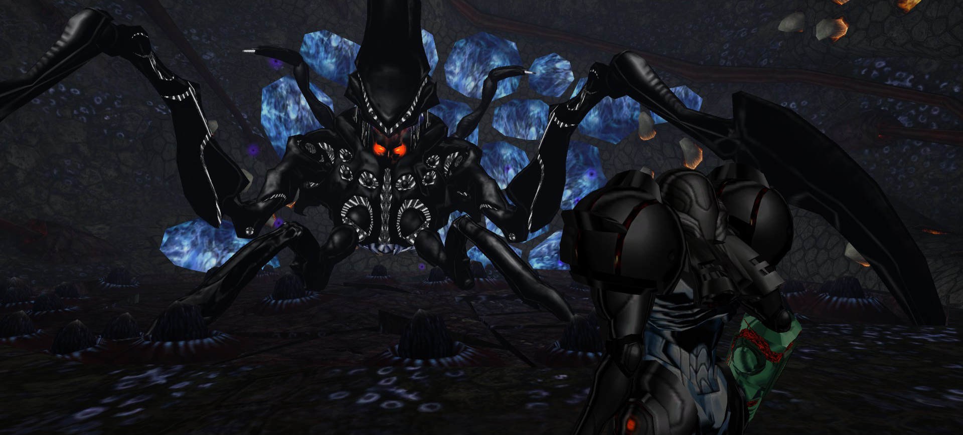
Take Metroid Prime, the final boss in the first game of the trilogy. It’s huge: large enough that at most times during the fight its entire bulk won’t be visible on the screen at once. While visually large bosses aren’t unique to Metroid Prime, the game does a great job making its final boss feel huge in relation to the player. The mechanics of the fight influence the player’s perception of the boss’s sheer size. Samus has to use her morph ball to roll under the Metroid through shallow tracks in the floor when it claws its way through the cavern at remarkable speed, causing the ground to shake and launch Samus upwards. Desperately rolling beneath the boss to avoid its claws makes the player feel small and vulnerable. Physical size has to affect the environment through visual, auditory, and mechanical cues to have its full effect on the player.
Now shift gears to see a similar effect used in a kids’ cartoon:
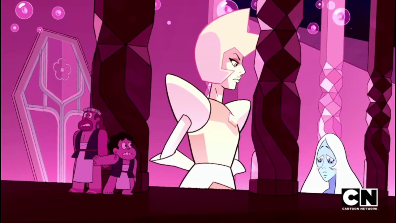
In Steven Universe, season 4 episode 15, we see Steven and Greg (lower left) in the same room as the alien tyrants Blue and Yellow Diamond. Like in Metroid Prime, the size difference is noticeable in more ways than one, through the echo of the giant Diamonds’ footsteps and the soft rush of air when they gesture with their hands. The room itself is clearly designed for massive beings like the Diamonds, based on the high ceiling and impressively tall doorway. Greg and Steven are collectively about as large as Yellow Diamond’s entire chest, while the tiny Steven is about the same size as Blue Diamond’s head.
The hierarchy of scale operates on multiple levels: first, to build tension as our human heroes risk being discovered by their gigantic enemies in a place they shouldn’t be, and second, to show Yellow Diamond’s superiority over Blue Diamond, who is lower and visibly downcast in the bottom right corner, as Yellow stands tall and powerful. Blue is exhibiting human vulnerability, so she’s placed symmetrically across from the humans (well, human and half-human) characters at about the same size. Yellow Diamond thus commands the scene as she sings her chilling chorus, “What’s the point of feeling, Blue?”
The takeaway: look for ways to construct a hierarchy of scale in your work that engages more than one of the audience’s senses. The more ways you can convey largeness and smallness, the more immersive your scene will be. You can also use scale (as in the Steven Universe example) to subtly tie together seemingly disconnected objects under a common overpowering force.
Emotions are scarier
Comics can use hierarchy of scale in a way the other two media discussed cannot: rendering panels larger than others on the same page, and in greater detail, to signal narrative gravity to the reader.
We’ll look at an example from Saga: Chapter 6 (Page 8, panels 1-4).
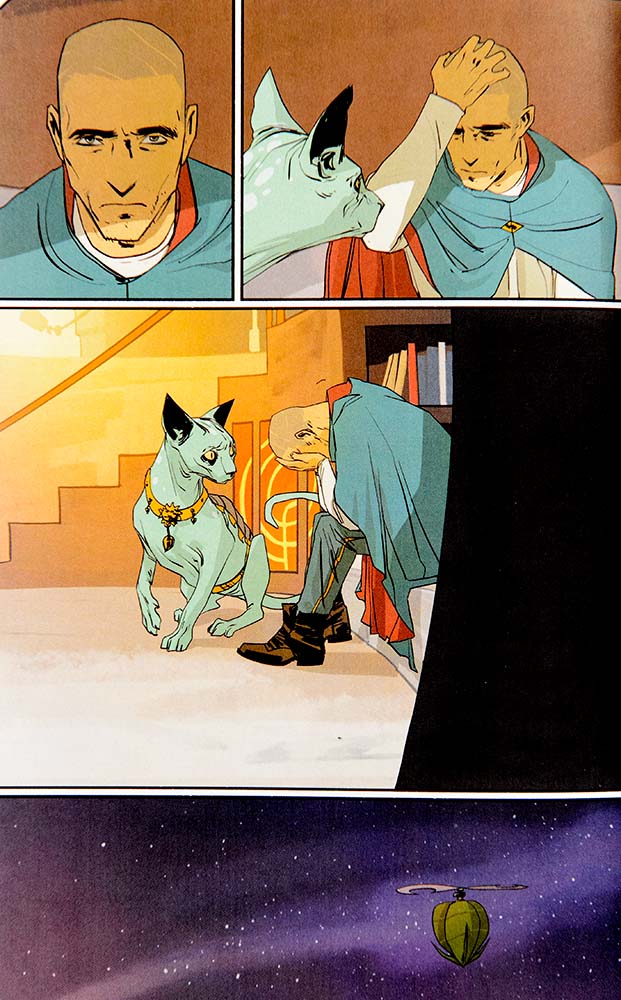
Here we see bounty hunter The Will in the immediate aftermath of learning someone he cares about has died. A shadow falls across his face, his eyes focus intently in front of him. He clutches his head as if to assure himself of something tangible and solid, then buries his face in his hands. His nonhuman companion, Lying Cat, senses the internal crisis of her owner.
The final panel punctuates the scene by revealing the vast, cold nothingness of space surrounding our grieving bounty hunter. But what is the hierarchy of scale telling us about the scene? For all the infinite light-years of space, The Will’s internal suffering and loss still occupies three of four panels, and about 80% of the page visually. All the unlivable emptiness of space is not as strong as what The Will feels in this moment. Does that give you the chills? It does to me.
So play around with reversing your hierarchy of scale to surprise your audience and amplify the significance of the little things. When a person grieving death is more visually important than the unimaginable expanse of the stars, your reader will notice, conscious or not, and feel your scene more strongly for it.
Last word
The cool thing about hierarchy of scale is that it’s visceral. Your reader, or player, or viewer, doesn’t need to be literate in the medium you’re using for them to feel the thematic and evocative effects of scale on some level.
Originally I had only planned on covering Saga with this post, but I felt the other two examples were important and related enough to wrap into this. The result is a longer post than I was planning to write, that took more time than I was expecting! In the next few weeks I’ll hopefully get a better grip on what “micro-critique” means and how to keep this series manageable for me.
‘Til next week!
This post was written with support from Patreon. Please consider following or pledging to my campaign to help me keep doing this. Have a response? Write me an email.